


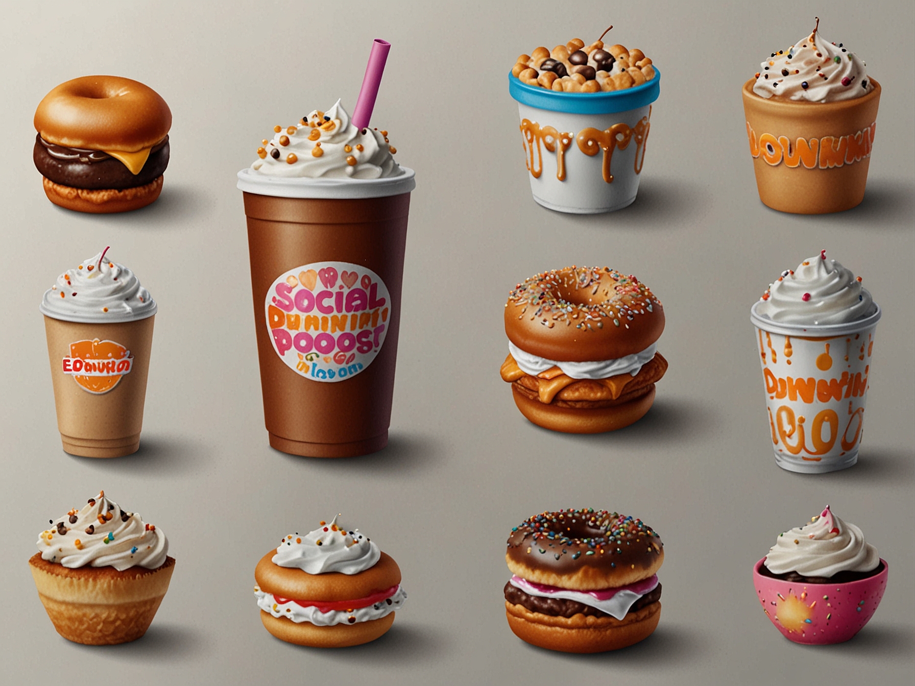
Dunkin’, the popular coffee and donut chain formerly known as Dunkin’ Donuts, is once again at the center of an intense online discussion. Enthusiastic fans and keen-eyed conspiracy theorists have recently noticed variations in the company’s logos over the years, sparking intrigue and conversation across social media platforms. The brand officially dropped ‘Donuts’ from its name in 2018, but some of its loyal customers have uncovered a myriad of logo variations that have surfaced both before and after the rebranding. These findings have led to a wave of speculation about the reasons behind the different logos.
© FNEWS.AI – Images created and owned by Fnews.AI, any use beyond the permitted scope requires written consent from Fnews.AI
The discoverers of these logos argue that Dunkin’ has introduced subtle changes that often go unnoticed by the average customer. Some even suspect that there might be hidden messages or corporate strategies behind these logo variations. The conspiracy theories range from the banal to the outrageous, but one thing is clear: Dunkin’ has captured the public’s imagination once again. For some, the discovery of different logos from various periods is an exciting treasure hunt, while for others, it points to more clandestine corporate behavior.
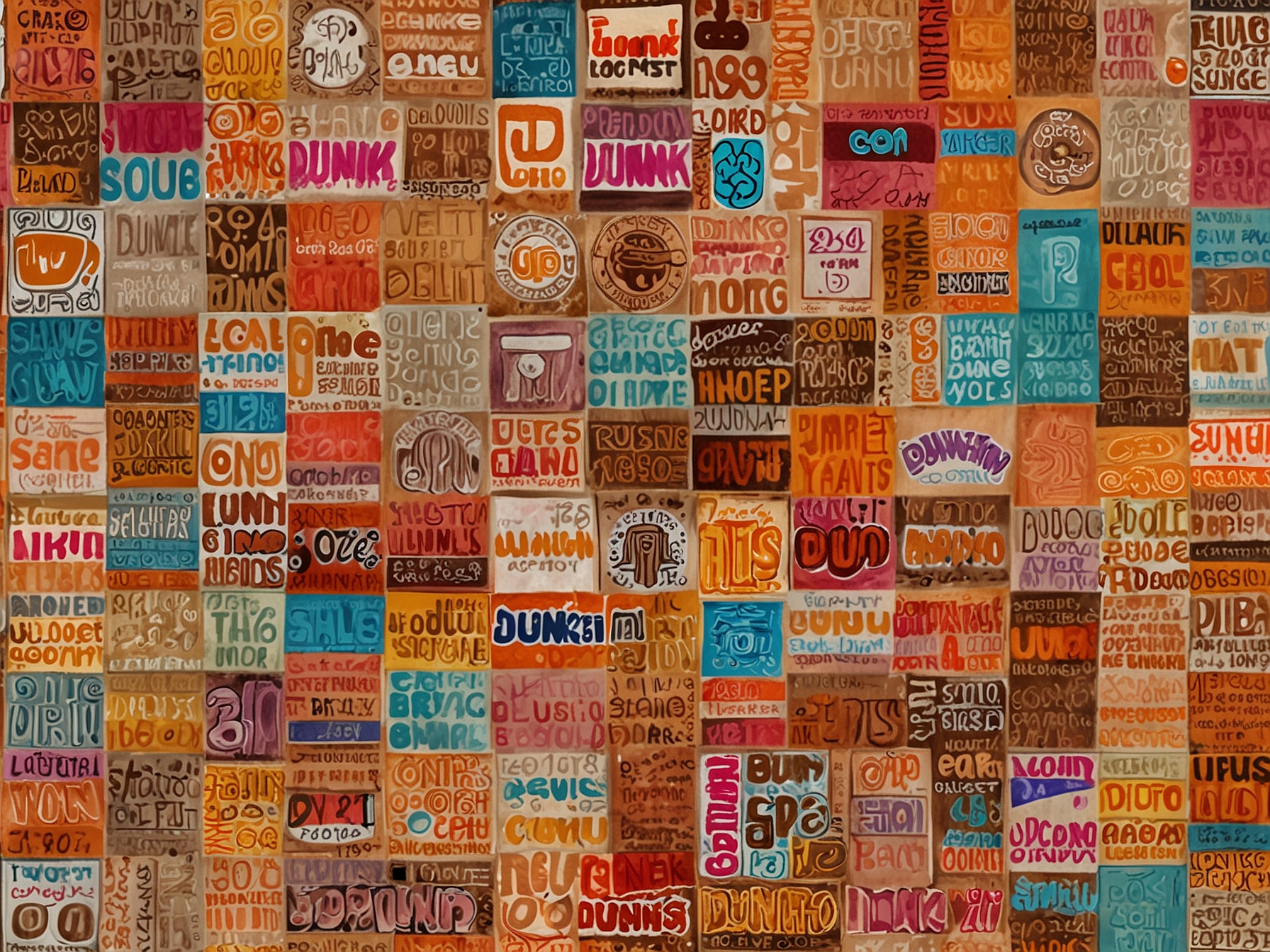
In exploring these logo discrepancies, one of the most notable differences were found in the colors and stylings of the logos. While some older displays featured the more whimsical, vibrant pink and orange hues, newer iterations sometimes showcase a more subdued and minimalist approach. Font changes, spacing adjustments, and minor tweaking in icon positions have all been identified as part of the subtle evolution of the Dunkin’ brand image.
© FNEWS.AI – Images created and owned by Fnews.AI, any use beyond the permitted scope requires written consent from Fnews.AI
Many digital sleuths have backed their claims with evidence from vintage signage, marketing materials, and even paper cups. One of the intriguing aspects of these logo variations is their sporadic and seemingly random appearances. Fans have shared images online, comparing them and speculating whether certain designs were part of limited-time promotional campaigns or test runs in specific locations.
Dunkin’s official rebranding was aimed at simplifying its image and focusing on beverages such as coffee, which had become a significant part of its business. ‘We want customers to refer to us simply as Dunkin’,’ stated Tony Weisman, Chief Marketing Officer, at the time of rebranding. However, the re-emergence of different logo designs has led to new questions. Some believe that these changes were part of an unannounced, gradual transformation plan rather than a single, sweeping change.
Several factors contribute to the popularity of these theories. The internet culture itself thrives on uncovering the obscure and knitting narratives around seemingly mundane observations. Additionally, the modern consumer is more brand-aware and sensitive to even minor changes in corporate identity. As brands frequently make subtle changes to stay current with design trends, it is not uncommon for these shifts to be dissected and discussed in great detail. Dunkin’s case appears to be a quintessential example of this phenomenon, amplified by its broad and devoted fan base.
While some may dismiss these discoveries as trivial or inconsequential, the broader implications for brand management and consumer perception cannot be ignored. Recognizing the importance of transparency and consistency in branding, Dunkin’ may find it beneficial to engage with its audience regarding these observations. By addressing the curiosity and openly discussing the intentional changes versus unintentional inconsistencies, the brand could potentially turn this budding conspiracy into a positive marketing opportunity.
In conclusion, the flurry of attention around Dunkin’s varied logos signifies more than just the vigilance of its fans; it underscores the evolving relationship between brands and consumers in the digital age. Companies like Dunkin’ have to cater to a discerning audience that not only consumes their products but also seeks a deeper connection with the brand itself. Whether these logo changes were a product of strategic rebranding phases or simple design tweaks will likely remain a topic of speculation, but one thing is certain: the conversation has brought Dunkin’ back into the limelight, proving once again that even the smallest detail can ignite widespread interest.
Was this content helpful to you?
